
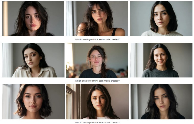
Nine portraits. One single text. The models, alphabetically: Flux 2 Pro, GPT Image 2, Higgsfield Soul 2, Ideogram 4.0, Krea 2, Midjourney v8.2, Nano Banana Pro, Reve 2.1.
Take a minute and assign each image to a model before scrolling. And a detail that makes it more fun: there are nine images and only eight models. One appears twice. The interesting question isn’t which one repeats, but whether you’ll notice that two of them are the same.
Every AI Model Has an Accent
A prompt isn’t an order to be obeyed. It’s a text, and every text needs someone to read it.
Each of these models learned to read with a different corpus, a different team, and a different idea of what a good image is. One grew up looking at editorial photography. Another grew up looking at design compositions with text on top. Another learned to place objects in the exact spot you ask for. When you hand them the same sentence, they don’t obey the same sentence: they translate it into what their training understands as beauty.
That’s the model’s accent. It’s not an error or a defect. It’s the fingerprint of its data, and you hear it the moment you put two results side by side. The useful question was never which is best. It’s which has the accent I need today, and how much I can correct it.
That “how much” has an uncomfortable answer, and you have it in front of you in two of those nine images.
Why the Prompt Had to Be Boring
Here’s what many tests get wrong. They write something weird, something brilliant, an impossible scene, and then compare who improvised best. That measures something else.
I wanted the opposite. I wanted the exact center of the latent space. The densest zone, the most trained, the portrait that exists repeated millions of times in any dataset: young woman, close crop, window light, neutral background, 85mm.
If they’ve all seen that image a million times, the logical thing is that they’d return almost the same. Well, no. On the first try they already diverge, and that’s the point: when the text adds no strangeness, every difference you see is pure training, each model’s own taste rising to the surface.
This is the description, identical across all eight:
A close-up portrait of a young woman with dark hair looking
directly into the camera, lit by soft natural light coming
from a window on her left, standing against a plain neutral
grey background, shallow depth of field, shot on an 85mm lens.
No text in the frame. No hands. No objects. Nothing that hands the test to the models strong at typography.
That text, without changing a comma, I pasted into all eight models: Midjourney v8.2, GPT Image 2 inside ChatGPT, Nano Banana Pro, Reve 2.1, Ideogram 4.0, Flux 2 Pro, Krea 2, and Higgsfield Soul 2. None got a version adapted to its syntax. The same sentence for all, written in no one’s dialect.
A note on aspect ratio, so it’s clear and free of mystery. All eight had to come out in 16:9. In the ones I ran by API or by an interface with a framing parameter, Flux, Midjourney, Krea, Higgsfield, Ideogram, and Reve, you just set the ratio and you’re done. But ChatGPT and Nano Banana I used in a chat environment, so there I wrote “Aspect Ratio 16:9” inside the text itself. And it’s worth knowing that this doesn’t change the image the model generates, only how the frame is presented. Nothing more. It’s not a trick or a trap, it’s the difference between clicking a setting and having to ask for it in words because the chat interface doesn’t give you the button.
Rules fixed before generating, not after: first try, no re-rolls, no picking the one I liked most. All normalized to the same longest side without upscaling any of them.
And a note on what happens to your text between when you write it and when the image appears, because it’s not the same in all of them. ChatGPT and Nano Banana Pro are multimodal, which means there’s more than one layer between your sentence and the pixel: the model interprets, expands, and orders what you asked before drawing it. It sounds like a disadvantage and it’s exactly the opposite, part of their better prompt adherence lives there, they grasp the intent instead of translating loose words. Reve plays another card: it adjusts your prompt under the hood so the result comes out better, even though it doesn’t show you the final version it used. For the rest, I assumed they didn’t touch the text, and if they did, I simply judged the image they returned. After all, that’s the only thing I see as a user.
Seven Models. Seven Different Readings.
Let’s start with the seven models that don’t repeat. One by one, what each did with the same sentence and where the seams show.
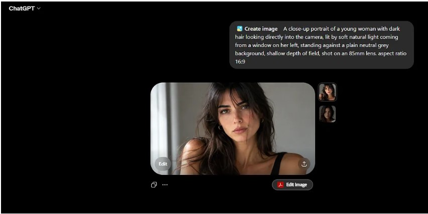
GPT Image 2 reads the paragraph as if it had to explain it to you. It’s the most obedient with the instruction and the most literal with the light: you ask for a window on the left and it gives you a window on the left, no argument. Skin texture is very good, the light source falls precisely on the eye reflections, and it doesn’t deform the iris, which is more than half this group can say. It has just one flaw, and you have to zoom in hard to see it: a slight cloud-like patterning in the background, the defect it was criticized for, that fine weave that shows up now and then and can spoil an otherwise flawless image.
Image created in chatgpt model:
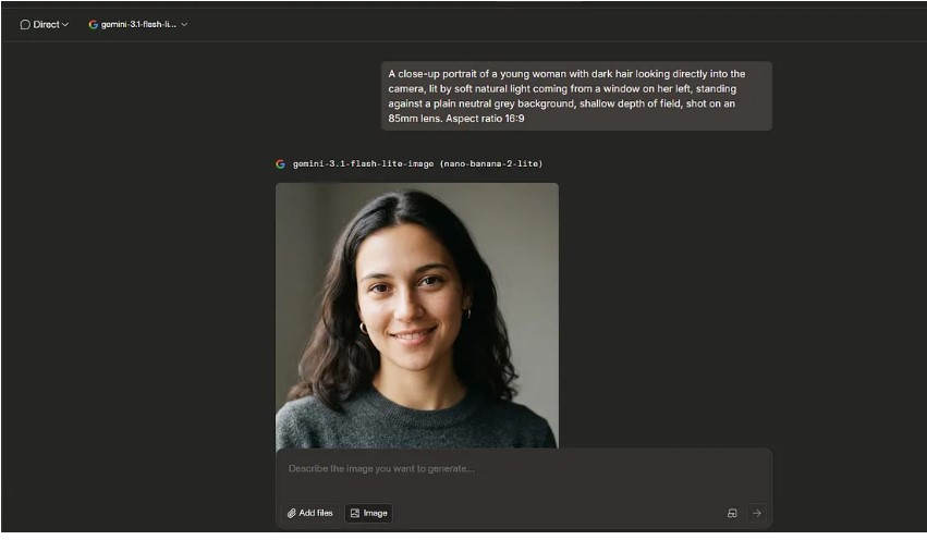
Nano Banana Pro builds before it renders. It’s among the most orderly in structure and among the best at resolving the physical coherence of a scene, because its strength is reasoning about what’s inside the frame. And yet, with such good credentials, the skin fails it. The freckle pigmentation looks algorithmic, like a Photoshop poster layer stuck on top rather than skin that actually has them. The lighting is correct, but the image doesn’t quite read as real, and a slight iris deformation creeps in. It understands the scene better than almost anyone and still doesn’t make it look like a photo.
Image created using Nano Banana Pro (for free)
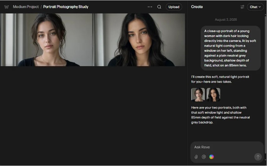
Reve 2.1 plans the composition as an editable layout and then renders it at native 4K. It gives good results, doesn’t deform the iris, the skin texture stays acceptable, and the lighting is coherent. Its problem is another: it gives itself away as AI at first glance. The textures are too regular and the result too averaged, that clean, accident-free mean the eye immediately associates with a generated image. It was somewhat eclipsed when Nano Banana Pro came out, though it still performs well. And it’s worth remembering that it adjusts your prompt under the hood to polish the result, so that carefully measured regularity may be, in part, its doing and not yours.
Image created in Reeve AI for free:
Ideogram 4.0 was born in 2023 as the typography model, the one that could write inside the image when none of them could get a letter right, and that label stuck. But its latest versions stand out for something else: hyperrealism. Here it delivers good skin texture, coherent reflections from a single light source in the eyes, correct focus, and, importantly, no iris deformation. It has two flaws. Up close a small patterning appears that softens the finish, the thing that keeps it from looking like a real photograph. And the model comes out with a slightly absent expression, as if looking without being there. Nothing serious, but enough to know it isn’t a photo.
Image created in Ideogram 4 for free:
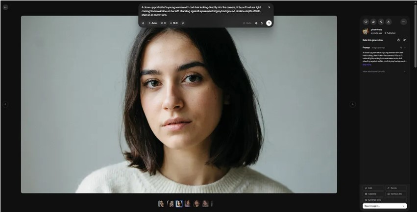
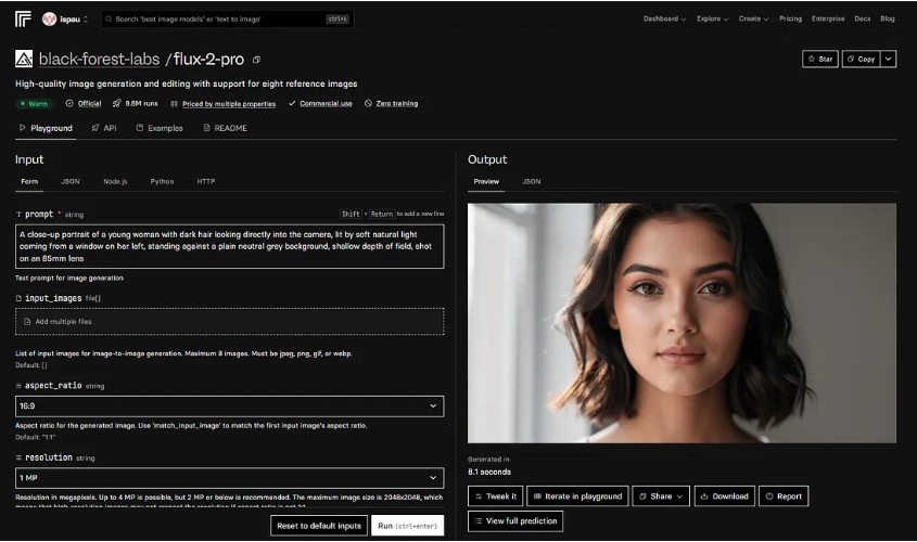
Flux 2 Pro was revolutionary in its day, especially the Kontext variant that let you edit images with instructions. But in this portrait the seams show. The skin texture has a porcelain effect, too smooth to be real, there’s a slight iris deformation, and the whole thing looks more like a realistic painting than a photograph. It chases killing the AI look and lands on a different but equally artificial one: the hyperrealist canvas that impresses from afar and falls apart up close. That’s why it closes my table, not because it’s bad, but because the rest have learned to look like a photo and it still looks like a canvas.
Image created in Replicate Flux Pro platform:
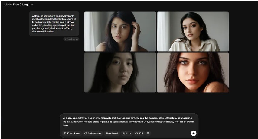
Krea 2 arrived promising hyperrealism, and some compared it to Nano Banana Pro. The reality is more modest. The image comes with skin smoothing plus a pore texture layered on top that recalls clone-stamp abuse in Photoshop, and that trick makes the eye focus stand out unnaturally. On top of that there’s iris deformation, an issue many models trained from Stable Diffusion carry. It has personality, no denying it, it was built from scratch against the AI look and treats your prompt more as invitation than order. But personality isn’t realism, and here the difference shows.
Image created in Krea 2 for free:
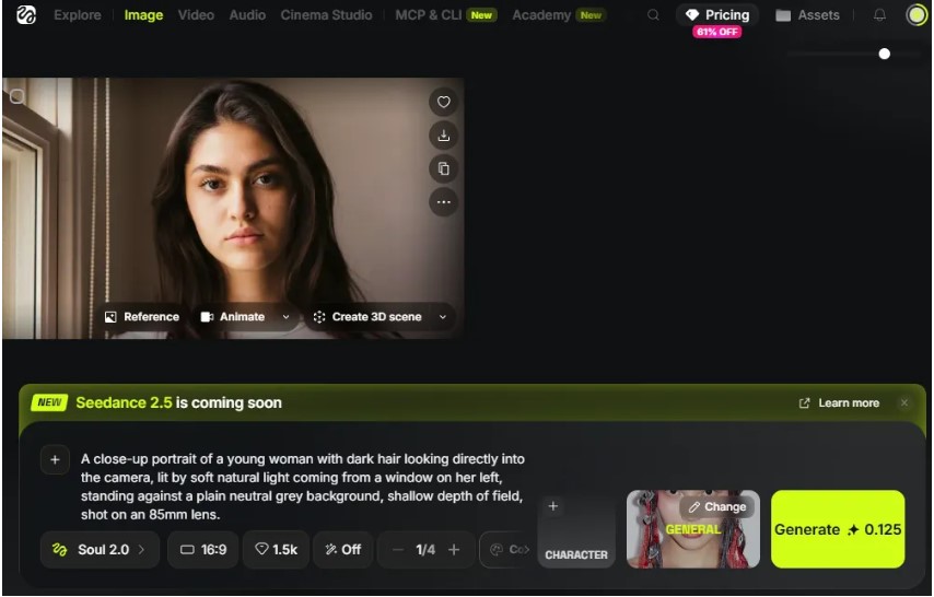
Higgsfield Soul 2, here with its default style, General, comes from a company that has grown a lot, especially by incorporating video workflows. And Soul was, in its moment, a small revolution for the opposite of what you’d expect: instead of the polished campaign look, it showed casual images, looking like they were shot on an iPhone, moving away from the uniform aesthetic of the rest. That’s its accent, the spontaneous photo before the perfect photo. Here the skin treatment is quite a bit better than Flux’s, though it carries a slight patterning similar to Ideogram’s and makes iris-deformation errors. Authentic in intent, still imperfect in execution.
Image created in Higgsfield for free:
Seven readings of the same paragraph, and none let you touch a single number to correct it. Two images remain to be explained, and both are from the same model: Midjourney 8.2.
Why Midjourney Appears Twice
Same text, same aspect ratio, same version, same day. The only thing that changes between them is the parameter tail, and that’s where everything lives.
Images created in Midjourney:
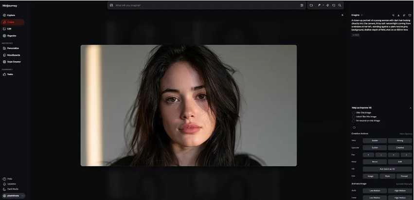
Look at them together. And notice the one on the top on its own first, because it’s among the best in the test: very good skin texture, coherent light in the eyes, no background patterning, and just one minor defect that shows up in some runs, a slight iris deformation. Midjourney v8.2 just came out and already starts from a very high realism before you touch anything.
Now break down the tail on the next one, which is where the difference lives. is the key piece, and the one no other model replicates the same way. It’s a personalization profile, a style Midjourney has learned from a set of images you choose and rate. It’s not a filter or a generic preset: it’s your aesthetic criteria turned into a code you can paste at the end of any prompt. The It’s the amount of styling we apply to the image.
The most honest comparison in the whole experiment isn’t Midjourney against the other seven. It’s Midjourney against itself: the base model, already excellent, against the model bent to your taste with two parameters.
If you know how to use a tool, you’ll unlock its full aesthetic potential. Because if you don’t choose the style, someone else already chose it for you.
You can view all of Midjourney’s parameters here: Midjourney Parameters
Parameters vs. Understanding
So far Midjourney comes out reinforced, but a serious comparison has to measure what its approach doesn’t solve too. And there’s a terrain where its architecture falls short.
Midjourney doesn’t reason about what you show it. You give it a reference with and a weight with, and you’re not telling it understand this photo, you’re telling it drift toward this style zone with this intensity. It’s blind to content, and that’s why it’s reproducible: the same weight gives the same result today and three months from now. GPT Image 2 and Nano Banana Pro do the opposite: they read the reference, understand that the light enters from the left, and generate from there. There’s no number to adjust, there’s language.
And the split isn’t binary, it has three levels. Full-fledged multimodal, reasoning over text and image: GPT Image 2 and Nano Banana Pro. Hybrids that reason about what you show them but paint by diffusion: Flux 2 Pro and Reve 2.1. And pure diffusion, where a reference is style, never content: Krea 2, Ideogram 4.0, Higgsfield Soul 2, and Midjourney itself. A dial is documented and repeated. A reading hits on the first try and can’t be cloned. Precision versus comprehension, choose by the job not by “loyalty”.
And here’s the honest part, the one you won’t like if you’re in the Midjourney camp: on prompt adherence, Midjourney loses. You ask it for something specific and it often interprets whatever it feels like, whereas a multimodal like GPT Image 2 or Nano Banana Pro reads the sentence, understands it, and gives you exactly what you asked.
That’s why my ranking is about hyperrealism, not obedience.
Midjourney tops my table because it makes the most believable skin in the group, but if what you need is faithful respect for a complicated scene, with several objects and relationships between them, the multimodals are above it and no parameter fixes that. They win in comprehension what Midjourney wins in texture. That’s the limit of the experiment, and whoever ignores it will end up fighting the wrong tool.
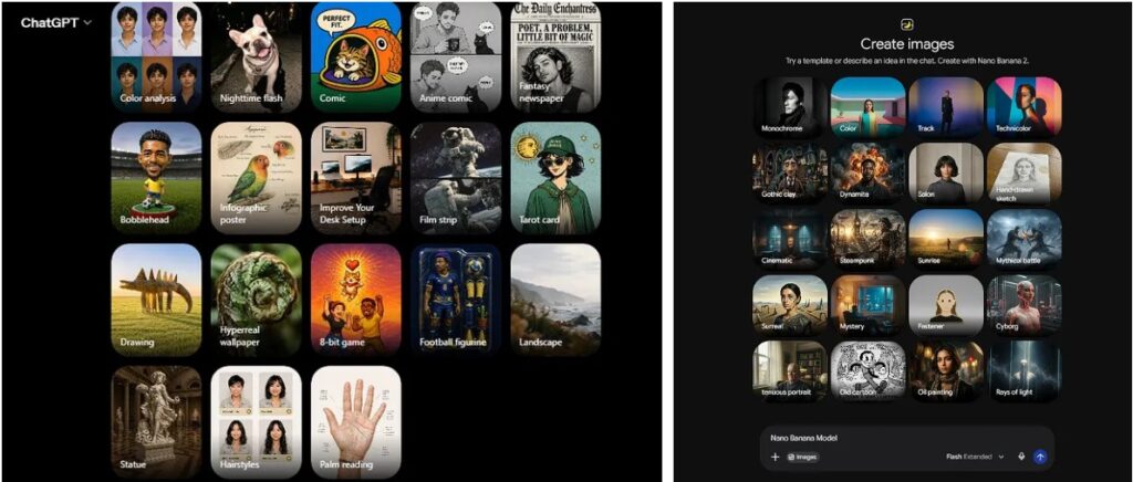
And that texture precision explains my best image of the experiment: the Midjourney with you already saw. The base model is already realistic, but adding a profile trained on your own references makes the jump a category up, with excellent skin, zero iris deformation, and coherent light. It’s not my whim: the impact of styles has been such that OpenAI and Google are adding their own selectors. The idea Midjourney turned into a method, the others are copying as a feature..
Conclusions
This experiment is a portrait, and only that. It says nothing about typography, product, or illustration, nor about which model will be best tomorrow. But it makes three things clear.
A way of seeing: eight models, one paragraph, nine images and not a single match. The difference wasn’t put there by the prompt, it was put there by the millions of images each one saw before meeting you. That’s the model’s accent, and once you see it, you can’t stop seeing it.
A method: equalize everything you can and declare what you can’t. Same description, same aspect ratio, same run, same resolution. What survives is pure accent. And the corollary that holds for any tool: there is no prompt without parameters, only parameters you can’t see. If you don’t know what value a setting has, that setting is still there, decided by someone else.
And a table, best to worst, after looking at each image up close, iris included:
- Midjourney v8.2 with a personalization profile. Out of competition on sheer power. High realism at the base and, with a profile trained on your own references plus a high stylize, excellent skin texture, no deformed iris, coherent light. The parameters are its moat.
- GPT Image 2. Very good skin, precise light in the eyes, no iris deformation. Only the slight cloud patterning on close inspection keeps it from being perfect.
- Midjourney v8.2, plain. Just out and already with very good skin and coherent light, no background patterning. A slight iris deformation in some runs is its only drag.
- Ideogram 4.0. The biggest surprise. Real hyperrealism, good skin, coherent reflections, no deformed iris. It loses on a small patterning up close and a slightly absent expression.
- Reve 2.1. Good results, iris intact, acceptable skin, coherent light. But it gives itself away as AI through its regular, over-averaged textures.
- Nano Banana Pro. Generates very well and understands the scene like few others, but the skin fails: algorithmic-looking freckles and a slight iris deformation strip away the realism.
- Krea 2. It promised hyperrealism and settles for photoshopped skin with fake pores and iris deformation, a legacy of its Stable Diffusion lineage. Lots of personality, little realism.
- Higgsfield Soul 2. Tied with Krea in my assessment. Its charm is the casual iPhone-style aesthetic, and its skin beats Flux’s, but it carries patterning and iris errors.
- Flux 2 Pro (for free) Closes the table. Porcelain skin, slight deformed iris, and a finish that looks more like a realistic painting than a photograph. Revolutionary in its day, now surpassed on realism.
That Midjourney takes both first and third place, with the same version and one profile apart, is the whole article in a single line of the table. But read it with its fine print: it’s a table of hyperrealism, not of obedience. Midjourney makes the most believable skin, and even so, if your scene is complex and you need it respected in detail, a multimodal will serve you better. For years we thought we were writing prompts, when in reality we were accepting someone else’s defaults.
Did you know all the listed models? How many did you guess correctly? Tell me in the comments, I’m curious to see who spotted the repeated model. See you in the next article.